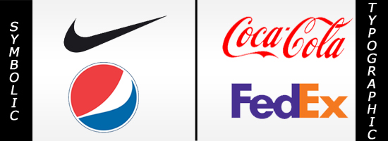
Corporate logos can be categorized into three broad and distinct categories based on design features. The first category employ only symbols, the second kind use just typography and the third type are a combination of both. Each of these form of logos have a unique impact on the brand identity. The main concern for designers is to identify which category suites their client’s identity development needs.
Most clients want their logo to look attractive and that’s all. They don’t realize the design aesthetics of employing elements correctly. The real purpose of a logo is not to appear visually appealing but to communicate the brand purpose to the intended customers. But what factors determine whether to use a symbolic logo or a typographic logo for your brand identity?
- When to Use Symbolic Logos:
Before we go onto its usage, let us first discuss what role a symbol plays in logo designing. A symbol or a pictogram consists of a mixture of graphic images that evoke a message to its viewers. A symbol in a logo can comprise anything from basic shapes to conceptual images that portray a specific meaning for the business. In order to get a better idea of symbolic logos, picture famous brands like Nike, Pepsi and Starbucks. Here are some pointers that you need to keep in mind before using symbolic logos:
- Use a symbol based logo when the name of business entity is too common or familiar sounding.
- For companies whose name is elongated in size, adopting a symbolic logo is prudent.
- Some companies have a broad portfolio of brands under their corporate entity. A unified symbolic logo is prudent to associate all of them to its main company.
- Communicating a symbolic logo is costly and incurs relatively more marketing expenses for educating the customers what the symbol means.
- When to Use Typographic Logos:
Talking about a typographic logo, it includes a wordmark or font-based design. It is basically used to reveal the company’s brand name. One of the core functions of these logotypes is to keep your brand identity simple and memorable. To get a better idea of typographic logos, envision brands such as Coca-Cola, FedEx Courier and Google Inc. Following are some valid occasions to use a typographic logo for your brand identity:
- A typographic logo is most effective for companies whose name is unique and self-explanatory.
- Also for entities whose corporate name is short and clear, a type-based logo is effectual.
- For a company that manages one or two brands, a wordmark is easy to use.
- If the goal of your client is to make their name memorable, you can opt for a typographic logo that shows only the company name in a nice font.
To sum up, I would recommend that a designer must first thoroughly analyze the nature, scope and purpose of the corporate entity before decided on the type of logo to design. Whether to use a symbol or wordmark depends solely on the type of corporate identity you are working on.


