
Whether it’s used in signage, print literature or as a logo, neon has an undeniably strong effect when it comes to graphic design. Whether you’re looking to add a retro flair to your artwork or create a futuristic edge to your design, neon is versatile yet often-overlooked weapon in every designer’s artillery. But why is that? Put simply it’s a question of balance; use it wisely and you’ll create something iconic, eye-catching and enduring. Get it wrong and you risk cheapening or outdating your brand. Here we take a look at some of the best ways to incorporate neon into your graphic design and the message this shiny-bright technique conveys to your target audience.
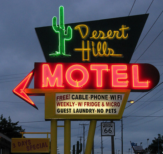
There’s no getting away from the fact that neon is kitsch. And what do we mean by kitsch? Think about the way that many people love-to-hate Abba, or the nostalgic safety an episode of Happy Days affords viewers. It’s classic, attainable and comes with a large helping of tongue-in-cheek self awareness. Take a look at this vintage-inspired motel sign for a picture that perfectly sums the term up. Be deliberately brash and bold and you can instil a sense of irony and humor into your organization – this especially true if you run a so-called ‘serious’ enterprise. Be careful; temper the use of neon with more understated and classic design techniques for instant cool and character.
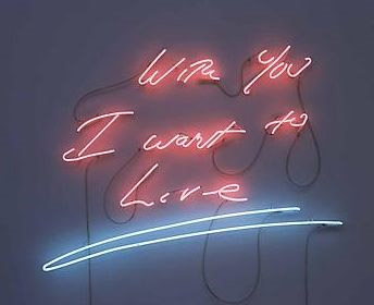
There’s more to neon than Vegas-inspired glitz. Here’s an example of celebrated contemporary artist Tracey Emin’s take on neon. Her beautifully moving selection of handwritten neon signage was recently exhibited at the Hayward Gallery in London, and demonstrates perfectly how to balance a sincere and honest statement with the razzmatazz of neon LED lighting. In a way, the juxtaposition of the profound with the brash serves only to heighten the impact.
Neon is also undeniably retro, especially when used with typography, and it’s worth considering this effect when you create your design. Perfect for discos, themed events and nightclubs, neon immediately brings John Travolta’s white satin suit, roller skates and Studio 54 to mind, as can be seen in this example of neon applied to text. The effect is further heightened by the use of bold, primary colours.

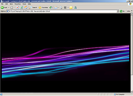
Paradoxically, neon also has the effect of adding a futuristic quality to graphic design, as this digital example shows. In part as a result of the choice of colour palette, and in part as a result of the subject matter, it creates a sense of the space-age simply, effectively and confidently.
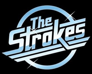
As a logo choice, neon is instantly striking and iconic. Take for instance this logo for rock band The Strokes; it’s a brilliant reflection of their 1960s roots, both in terms of their sound and style influence.
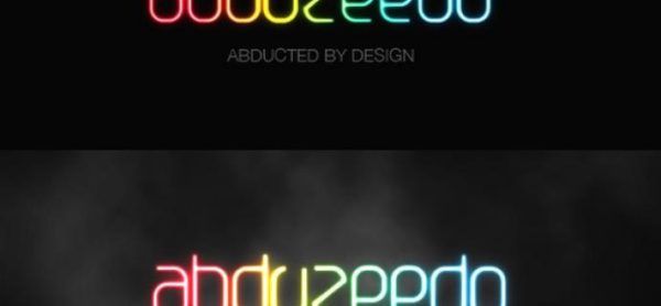
This shining neon-effect text logo shows how the technique can be applied to build an air of progressiveness and dynamism around a brand. Created in Photoshop by using a gradient overlay and layered text styles, the logo appears to have a halo-like glow around it – literally radiating brand-confidence.
One of the potential negative effects of neon is its slightly sleazy connotations. Picture 24-hour pool halls, back-street tattooists and basement bars and neon will undoubtedly spring to mind. That said, use neon wisely and you can create a sense of danger and excitement to your graphic design. Be bold with your colour choice with strong reds, blues and yellows and you will add a splash of sex appeal to even the most conservative of brands.
Amie writes on behalf of a Printerpix. Amie works in design and marketing. In her spare time she likes to learn how to code and plays the piano.

Interesting. I like the different design styles you’ve shown here. I like neon when it fits the design/image!
Nice one Amie 🙂