If you’re looking for a job these days, you’ll no doubt find it harder than you ever have done before. Even graduates of Universities are finding it extremely difficult to find work as there are simply not enough jobs to keep the entire population of most countries in work.
Not only this, but companies are also becoming more picky than ever in regards to the employees that they actually employ. Most companies are looking for someone who not only has an excellent track record but also, stands out from the crowd and offers innovative ideas for their business.
So how exactly do you stand out from the crowd? I mean, most employees will base their decision for the interview process on a piece of paper called your CV, but how do you make your CV stand out from all of the other job applicants? Here are a few tips.
Don’t Be Afraid To Get Creative

Usually, when people are writing their CV’s, they will open up Microsoft Word and start writing in a standard, boring font. Sure, this might work if you have some exceptionally impressive content to put in your CV but to be honest, this is still pretty boring and it has very little chance of catching the employers eye when they’re going through the huge pile of CV’s they’ve received.
Essentially, your CV needs to stand out from the crowd right away. This means that the employer should be able to glance at your CV and want to read it. The only way to achieve this is to get creative.
For example, take a look at the CV example pictured above. Sure, it’s not anything absolutely crazy and it’s still black and white, but you can see how it will stand out from a sea of bog-standard, Times New Roman CV’s any day of the week.
The clever thing about this CV is that it’s creative, yet also professional. It doesn’t use too much colour (in fact, it uses no colour) as instead, it relies on the clever use of typography and alignment to stand out.
It still contains all of the information that a potential employer might be looking to find out, it’s just presented in a more interesting and to-the-point manner.
Demonstrate Your Skills

Source: Deviantart
Most CV’s list skills; that’s nothing new. For example, if you’ve got a lot of Photoshop experience, it would probably be standard practice to include the words “3+ years experience in Adobe Photoshop”. This is all well and good but the thing is, these are just words. It’s doesn’t demonstrate to the employer that you actually have those skills (i.e. it provides no proof).
Often, you can kill two birds with one stone by utilising your skills in your CV design. This will not only lead to a more eye-catching CV design but also, will demonstrate skills that are required for the particular job that you’re applying for.
Take a look at the example CV above for example. This is the CV for a graphic designer and as you can see, it’s not only eye-catching but also demonstrates the skills of the applicant (i.e. graphic design).
Keep It Clean, Readable And To-The-Point
A common mistake with CV’s is to make them drag on for too long and also, contain far too much information. For example, a lot of people’s CV’s actually drag on for 2 – 3 pages and truthfully, this is not a good move.
Personally, I think that anything over one side of A4 is too much information for a CV and if possible, it needs to be shortened. Try and keep everything to-the-point. If there’s information in your CV that is slightly irrelevant or isn’t required, then you should get rid of it, no questions asked.

Source: Deviantart
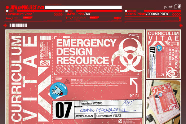
It’s also important that the CV is readable. Sure, it’s a great idea to get creative and even colourful with your CV but if this sacrifices readability, it isn’t a good move. Take a look at the CV above for example. It’s certainly creative and design-wise is pretty cool, but the problem is it’s not really readable and is a bit harsh on the eye.

Source: Deviantart
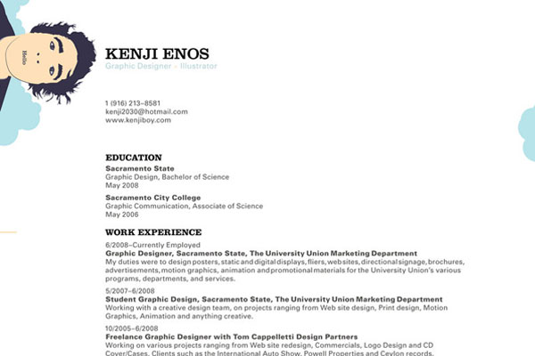
The example above is the opposite; it’s creative, uses colour well and also demonstrates the ability of the graphic designer. At the same time it is clean, readable and to-the-point. It only takes up one side of A4 and has all of the information an employer would want to see.
Create A Data Visualisation
Infographicsoffer a fantastic way of representing data which is why they’re so common online. The fact that the data is presented in a visual way makes the data more enticing and less like a bunch of stats and figures. This same technique can be applied to your CV.
If you think about it, your CV is just a page of information and data about yourself and typically, this can be quite boring. By creating a visual representation of the data (much like an infographic), your CV will not only stand out from a pile of boring black and white papers but also, ensure that the information is perceived in the most enticing way possible.

Source: Flickr
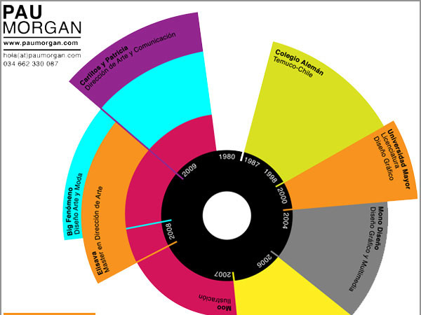
Take a look at the CV above for example; it’s essentially an infographic in the way it’s presented but as you can see, it catches the eye and makes boring data a lot more engaging.
Conclusion
Really, it’s all about being creative and to be honest, if you’re the right candidate for the job, you’ll know how to unleash your creativity in a way that’s going to impress the employer.
By following the tips laid out in the post, you’re going to heighten your chances of getting called back for an interview but you have to remember, it’s all about your personality and face-to-face appearance from that point. A piece of paper won’t help you after the initial stage.
Joshua has been self-employed for a number of years and therefore, has received many CV’s from potential employees. He’s also a design enthusiast and currently works for the printing company DBP who specialise in short run printed products such as banners and stickers.


