Creating a logo that embodies a company’s entire industry, specialism and unique selling point is incredibly difficult. It’s even harder to try to incorporate a business’ personality into their logo. To do all of those things, while still making a beautiful, aesthetically pleasing design, is a monstrous task. Some designers prefer to make use of the negative space in a logo design to incorporate fun, quirky elements to help show the personality of the brand – and sometimes the whitespace is used to give a small nod to their industry that they’re in.
We’ve selected a collection of beautifully designed logos that make use of negative space to help inspire you when you next need to design a brand identity.
WoodenHouse

Source: http://logopond.com/gallery/detail/41911
Storm Foundry

Source: http://dribbble.com/shots/138562-Storm-Foundry
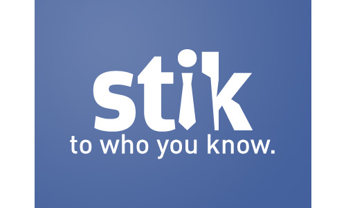
Stik

Source: http://dribbble.com/shots/26870-Stik
Pittsburgh Zoo

Source: http://pittsburghsblackandgold.blogspot.com/2009/01/slow-day-at-pittsburgh-zoo.html
Pencil

Source: http://www.designyourway.net/logo/pencil.jpg
Pacific Tax & Financial Group

Source: http://dribbble.com/shots/171942-Pacific-Tax-Logo
IllusionzWinebar

Source: http://www.logofaves.com/2010/12/illusionz-wine-bar/
Illusion

Source: http://www.logofaves.com/2010/01/illusion/
Friends of Jacksonville Animals

Source: http://dribbble.com/shots/171866-Friends-of-Jacksonville-Animals-Logo-B-W-
French Property Exhibition

Source: http://www.logofaves.com/2011/06/french-property-exhibition/
Food Writers

Source: http://www.logofaves.com/2008/11/food-writers/
Emovino

Source: http://www.logodesign-uk.com/logo-design/emovino-logo-design-wine-distributor-paris/
Electric Elephant

Source: http://logopond.com/gallery/detail/30813
Ecolectric

Source: http://dribbble.com/shots/158667-Ecolectric
Eat Innovations

Source: http://www.logofaves.com/2010/08/eat-innovations/
Dig

Source: http://www.logomoose.com/logo-design/dig/
Circus of Magazines

Source: http://www.logofaves.com/2011/03/circus-of-magazines/
Chaos

Source: http://www.logofaves.com/2011/02/chaos/
Bull Entertainment

Source: http://brandstack.com/logo-design/details/33750
Blue Mountain Electric

Source: http://logopond.com/gallery/detail/104277
Atack

Source: http://logopond.com/gallery/detail/61384
This article has been written by Daniel lennox a freelance writer working for for cs36.com, an online shopping and price compare shop.


~~~~~~~~~~~~~~~~~
The creatiVity of loGos live on!
Really nice collection! Inspiring, thank you.
One that is missing is FedEx, look for the direction arrow between E and x.
These are grrreat, as tony the tiger would say. I really like the Penn Zoo logo, had not seen that before. Another commercial favorite is the FedEx logo with the negative space forming the shape of an arrow. Thanks for the post!
Here is our logo, which makes use of negative space.
http://inventikasolutions.com/wp-content/themes/iBlogPro/images/logo-iblogpro-small.png
Those are brilliant! Thanks so much for sharing them.
“WoodenHouse” is nice.
Awesome logos but i like Pittsburgh Zoo the most.Thanks for sharing………..