
We are often told that less is more and in many cases it often is. Minimalism creates an impression of luxury that is clutter free and gives a clear message. We have come across a number of business card designs that do this beautifully and compiled a list of 20 we think are the best.
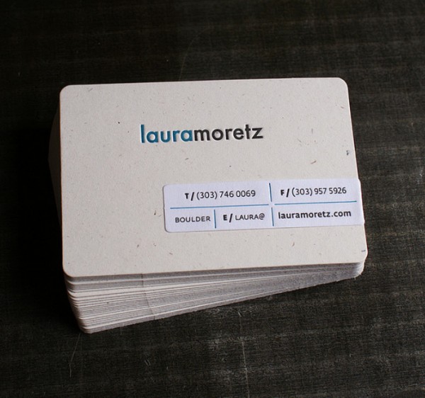
Embossing and textures add a little something extra to a card. Some of the best cards combine these with traditional values such as font and colour to magnificent effect. This card for Laura Moretz does so brilliantly.
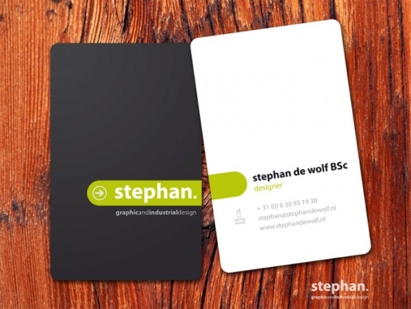
This card is simple and connects both opposing coloured sides wonderfully with the green line. The simplicity and clarity is wonderful and really brings a lot to the card.
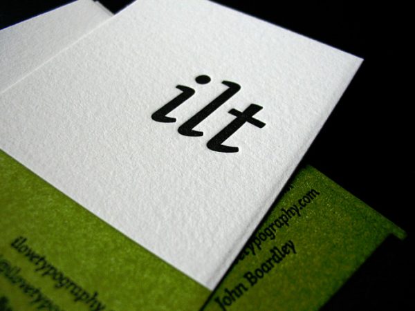
A company that is focused on typography is going to be under a lot of pressure when producing a business card ILT doesso wonderfully with this minimalist design.
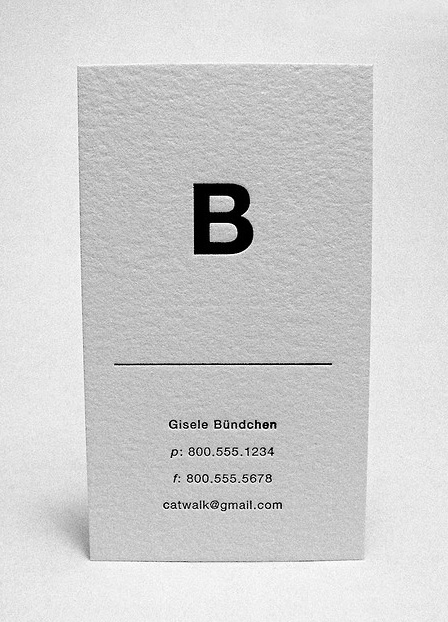
This typography and the message create a stylish card only supermodel Gisele Bundchen is worthy of.
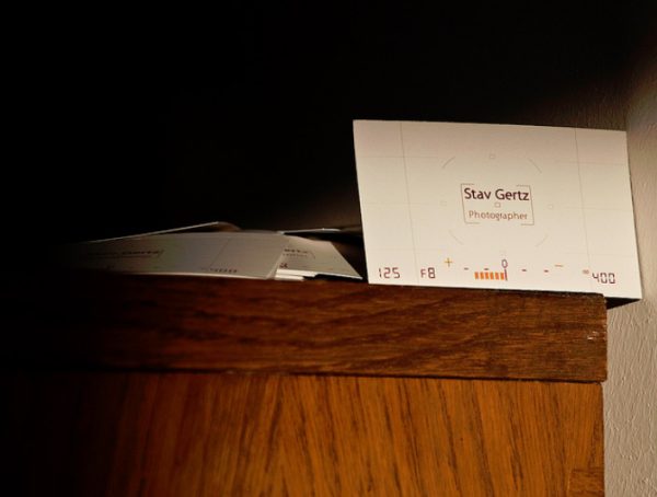
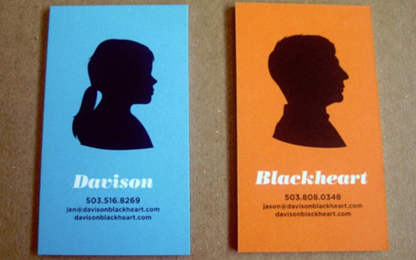
Another great way to orientate a business card is being able to tell what profession its owner is in without even having to read the card. This is a great example by Stav Garts.
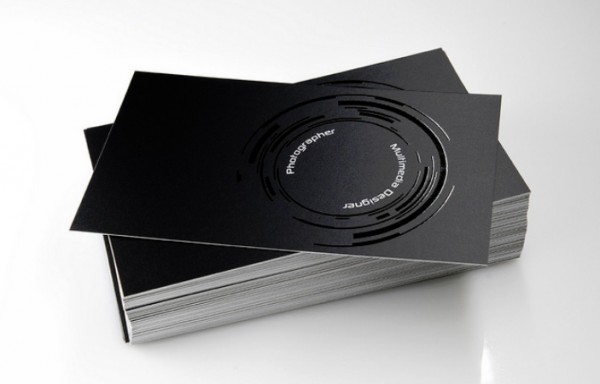
Here is another example of a photographer with a penchant for creativity.
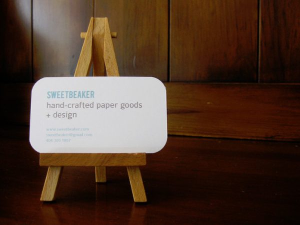
The edges of a card can also have an effect on how notable it is. These curved edges standout, but retain stylishness.
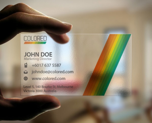
Here’s an example of the most minimalist of all – a transparent card, showing what can be done with the material used.
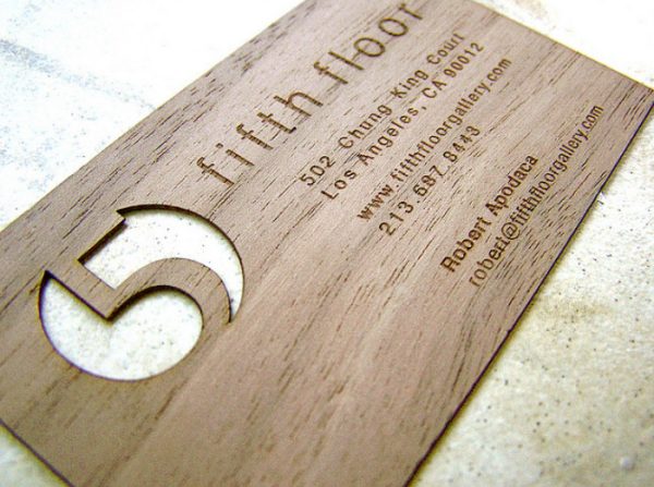
This card offers different take on the background or the texture used and once again a beautiful and apt effect.
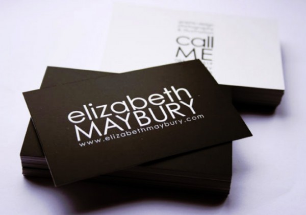
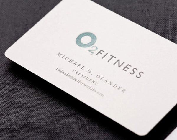
Though, the basic white background still has a lot going for it, clarity of purpose being one of the most major. Look at the strength of typography on this card – helped by the plain background.
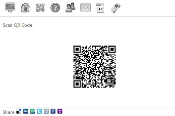
Cards don’t even have to have words with the invention of QR codes – these are truly minimalist. Beware as they can only be accessed by people with smart phones and the appropriate apps which may limit your customer base.
Cards don’t necessarily have to be the usual 16:9 dimension and longer or squarer cards can also work magic as we see from these examples.
Longer or taller cards can be a great way to make an impression; however just don’t expect them to fit into people’s wallets.
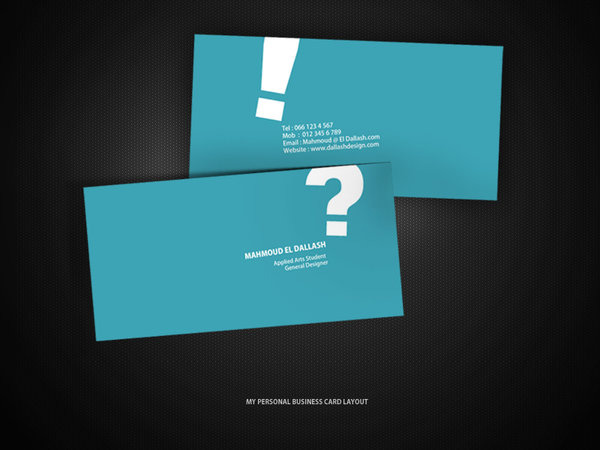
This card uses punctuation to great effect using the question mark and exclamation mark to almost comic effect.
As you can see from these inspiring examples, there are so many options for minimalist card design out there; you can easily create one that portrays your business in the right light.
This article has been written by Daniel lennox a freelance writer working for for cs36.com, an online shopping and price compare shop.
Some amazing designs here. I like the transparent card, but can imagine they would cost alot to print. I am currently working on business cards for my company and this has gave me great inspiration