If visitors to your website can’t find a page due to a broken link, or because they’ve made an error in typing the URL, it’s best practice to use a 404 page.
You’ll no doubt have seen these pages on your travels around the net, so you’ll be aware that some websites use 404s more effectively than others. In theory, a 404 should guide your visitors back to your site’s populated pages – using a link to your homepage or a search box allowing them to find the content they’re looking for.
But some sites go a step further, offering a creative 404 page that makes light out of the error. You might not be happy that you’ve landed on a 404, but at least you have something nice to look at while you’re there. Here are some of the most interesting examples…
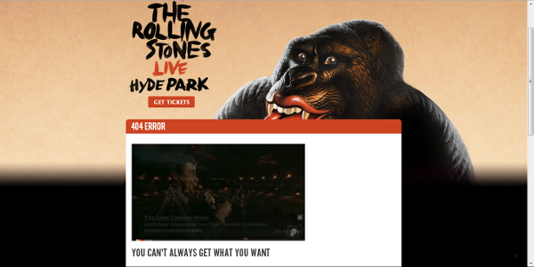
Rolling Stones
“You can’t always get what you want – but if you try sometimes, you just might find you get what you need.” The Rolling Stones use a video of one of their most famous tunes to let you know you’ve got lost through the power of song.
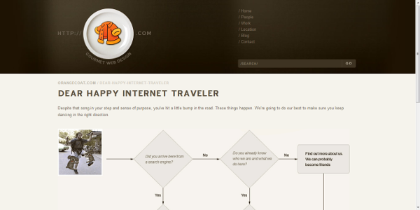
Orangecoat.com
“Dear Happy Internet Traveller” starts out the 404 page of Orangecoat.com. Then you’re granted the opportunity to use an innovative flow chart for a mildly entertaining look at how you came to be here and why. It’s fun, it’s creative; but it’s also really quite informative – ideal if you’re feeling a little lost.
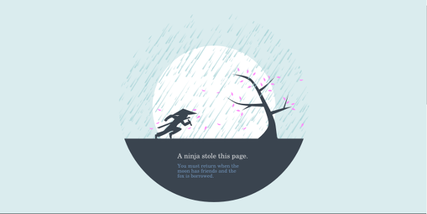
Huwshimi.com
A beautiful and witty design, that’s extremely effective in offering a light-hearted twist on getting lost. The text is slightly baffling but entertaining, and although it offers no obvious guidance on how to find what you were looking for, a simple click of the image will take you home.
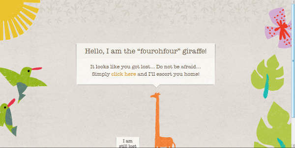
Giraffe
On its 404 page the restaurant introduces you to the “fourohfour” giraffe. “Do not be afraid,” he says. “I’ll escort you home.” This is a beautifully presented, friendly and happy page, with an obvious link to guide you back to the home page and its helpful content.
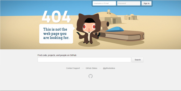
Github
A 404 that moves like a mirage as you hover your mouse over it, with the text “This is not the webpage you were looking for…” This is a fun, interactive error page with a Star Wars feel.
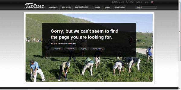
Titleist
The 404 page for this golf supplies brand fits with the theme of the site extremely well. A static image of lots of golfers looking for their balls, complete with links to the site’s more useful pages combines comedy with usability.
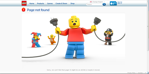
Lego
The Lego 404 page is sweet – offering an insight into what the world would look like if the web was built by tiny yellow, brick-wielding men. The image depicts Lego characters looking somewhat distressed as their friend accidentally unplugs the internet.
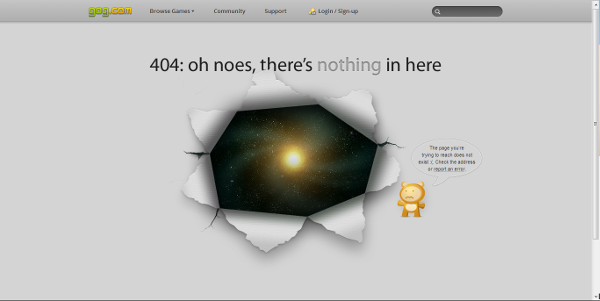
Gog.com
“404: oh noes, there’s nothing in here.” This 404’s text alongside the image of a webpage blown open to reveal the swirling vortex of outer space is dramatic. But the page has a lighter side too; a worried little bear, offering some helpful advice.
South Park
Pages written in the style of the characters themselves, South Park uses a variety of 404 messages to get the point across. From “You got served… a 404!” to “404!? Oh, Geez Cheese Louise!” these pages are simple yet effective, featuring images of the characters and a catch phrase on each page.
Ghostinthestream.net
Last but not least is this bizarre 404 offering from Ghostinthestream.net. No, this page is not helpful in any sense of the word – in fact, it offers a level of complete insanity. However, the dancing, flashing cat made of letters provides strangely compelling viewing. For about 10 seconds.
If you’re feeling friendly, why not offer your web visitors something extra when they arrive on your error page. This space allows you to be creative, brand-focused and fun, on an area of your website you could quite easily forget about. You never know, it might even start to drive traffic in the future by ending up on a list like this.
This post was provided by the content writers for HANDD business solutions.


