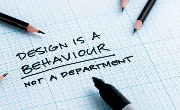
Signs are made to catch peoples’ attention and to get a point across. That point might be advertising an event, getting people interested in buying something, or getting the word out about an idea. A sign can convey all kinds of information, but if it is not reader-friendly, it will typically not be looked at, understood, or used to its full potential. Professional graphic designers follow a number of rules in order to make a sign effective. If you are going to make your own sign for your business or for an event at home, you may want to read on for design rules.

Keep it Simple
Too much information can confuse the reader, so keep your message simple and easy to read. Figure out exactly what you’re trying to convey and condense that message as much as possible. Also, overly fancy fonts can distract from your message, so make sure that the font is straightforward and easy on the eyes.
Similarly, too much text can discourage readers from spending time looking at your message, so refrain from being wordy. When it comes to signs, people want to quickly gain information from looking at them – not spend time reading through lengthy text. Use elements like contrast, space, and size to put your message forward in an engaging manner.
Know Your Audience
Figure out exactly who you want your sign to be read by. If you’re trying to sell a product or market an event, determine who your target audience is by considering factors like the age, gender, profession, and interests of the people that your item or event is targeted toward. Then try and determine what is appealing to that demographic and use it to your advantage.
For instance, if you are marketing apartment homes and you want more student tenants, you may want to give your marketing material a “youthful” feel by using bright colors and the type of language that appeals to young people. Also, consider the location of your business or event and use design elements that reflect the setting. For instance, custom signs in Los Angeles may use colors that reflect a hip, industrial vibe; whereas signs in Miami may use a summery color pallet and convey a relaxed feeling.
Make it Look Professional
A professionally made sign is structured, is free from grammatical and spelling errors, and is printed in a way that looks professionally done. If you have no design experience, you may want to look into hiring someone to handle your marketing endeavors. After all, the choices that you make relating to signage may be taken by potential customers as being indicative of the quality of your products or services.
Hiring on a graphic design team can be pricey, so you may want to consider ordering marketing material online.
Online sign retailers have made marketing easier by allowing you to customize your materials while using templates that stick to classic design rules. You can browse through different template options and choose the ones that are right for the goals of your business or endeavor. You can also use the above rules to design totally customized signs online. With help from the internet, good advertising is as easy as point and click.


