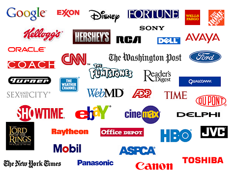
Whether you are just starting out as a new business or you are looking to give your existing image a revamp, it is well worth considering the psychology behind your logo. In recent years, those looking to design a logo on the behalf have others have begun to recognize just how much psychology is behind the purchasing decisions made by the general public. By considering simple factors such as how particular colors set certain images, you will find that your logo has a much bigger impact.

Getting the right color when trying to design a logo
Many business owners do not realize this, but something as simple as the background color for your logo can have quite an effect on potential customers and clients. Take health care companies for example, the vast majority choose to use white and blue in their logos. Members of the wider public may believe that this is down to some form of trend, however, it is because those two simple colors convey a message of trust and safety.
Choosing the right color for your logo goes much further than just plumping for whatever seems most appropriate. Don’t be afraid to mess with different shades, as doing so will be what perfects the image that you wish to get across. Going back to the previous example of using blue in health care logos, it is easy to see how different shades can create different images. A deeper shade of blue may be more appropriate, as it provides an image of strength as well as an image of calm. Choosing a softer shade of blue may still be acceptable, but only if the message you wish to convey about your company is one of serenity.
Finally, when choosing the right colors for your logo think about how they can also be incorporated in to the foreground image and text. Attempting to design a logo with a color scheme will get you much further than simply leaving your coloring to chance, and it will give you a basis from which to create other promotional materials.
Keep modernizing your image
Although it is good to design a logo that is consistent with your company and the image that your client base are familiar with, it is always good to keep modernizing. Take DKNY for example, their logo for their Tumblr feed was adapted to fit in with the innovative method of promotion that they were using.
Modernizing your image can be as simple as changing the font you use or incorporating a new design. When Gatwick Airport in the UK changed owners they found that all signs and logos had been copyrighted and no longer belonged to them. Their response was simply to invert the colors used and implement sharper images. Although such changes may at first appear to be simple, the modernizing approach taken by the new management allowed for Gatwick to gain more popularity with up and coming airlines.
Modernizing your image when it comes to logo design is a tactic that will always have quite a strong effect. Customers and clients like to know that you are prepared to advance alongside new technologies. By subliminally letting them know that you are prepared to make advances, you project an image of reliability.
Whether you want to design a logo for yourself or for someone else, think about the psychology that is going to go behind your design. By using a combination of appropriate color schemes and modernized images, you will convey an image that both old and new clients will feel comfortable with.
Stephanie Wagner is a freelance writer and online business owner who is enthusiastic about intricate logo designs. Although she is not associated with Logo Mojo in any way, she does recommend them for their approach to logo design.


A-one Mesh