We’ve all read industry experts holding forth about why UX is important and why all designers worth their salt need to offer visitors the best user experiences. There is no doubt that a website that boasts of an extraordinary UX has more chance of succeeding as compared to a website that delivers a very ordinary UX. But, the question is, what constitutes a great UX? What does a website with a really satisfying UX look like?
Take a look at the ten websites to get an answer to these questions.
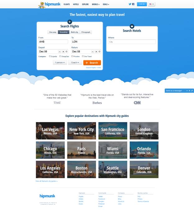
Hipmunk

What’s the first thing you think about when you come across some of the popular sites for online flight search – Chaos! At least that’s what I think, and this is where a site like ‘hipmunk’, comes in to save the day, with its simple linear flight search process that doesn’t look tremendously visually appealing, but delivers extraordinary functional value. The focus of the design is to prep up its functionality, making for a great UX.
OKA
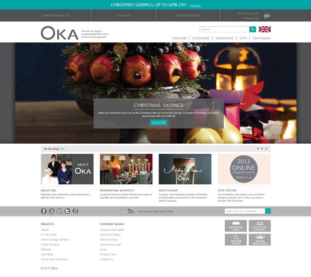
OKA is a luxury furniture seller and the site leaves no room for doubt about what the business does. You are greeted with high quality product images and a ‘Shop Now’ button that takes you to the product page. This is where the UX of the site really kicks in to make an impression. It is extremely shopper friendly with a navigation bar and search tool at the top of the page. The excellent use of white space improves clarity and accentuates the visual appeal of the page; it also helps put the spotlight on product images, as all good ecommerce sites should. It is a text book example of how great user experiences must be built and aligned with the brand and its purpose.
Gatwick Airport
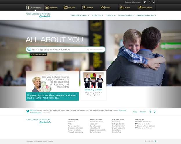
The first thing that you will notice when you take a look at the Gatwick Airport’s website is that it is extremely color coordinated. The UX is out of the top drawer because it doesn’t try too hard to make an impression. The design maintains a consistency through the website and also doesn’t lose its sense of simplicity. It is clean, uncluttered and ensures anybody searching for information will be able to find it, quickly and conveniently. It is everything that an airport website should be.
Times Skimmer by The New York Times
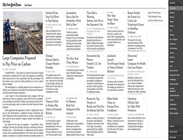
The New York Times launched the Skimmer Page to offer its readers a newer, quicker and much improved way of consuming news online. And boy does it work! When you skim through the Skimmer, you feel you are actually going through a physical newspaper. There are seven different layouts for the user to choose from and all of them offer a tremendous reading experience to the user. With its grid based design, the Skimmer ranks right there at the top when it comes to the UX of news websites.
University of Arizona Cancer Center
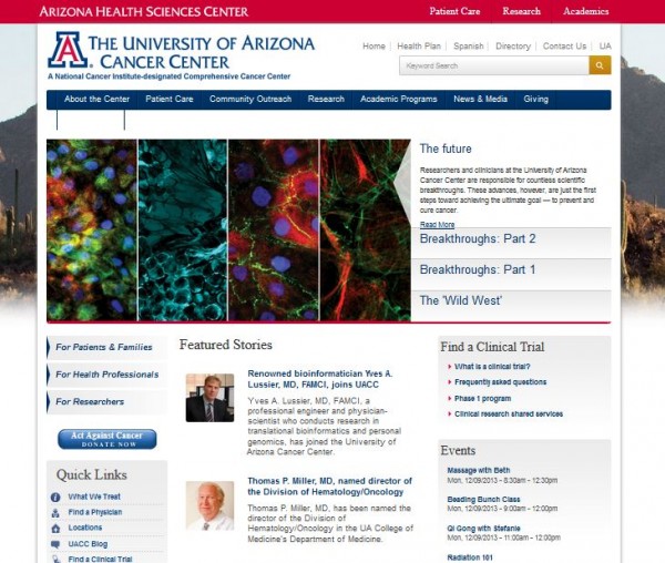
What do you expect from a hospital site? Straightforward information that is easily accessible? You get that and a whole lot more on the University of Arizona Cancer Center website. Any hospital site needs to take into consideration that not everybody using the website will be technically savvy. The Home Page of this site makes things really simple for everybody. On the left, clearly visible are three categories titled, ‘For Patients & Families’, ‘For Health Professionals’ and ‘For Researcher’. This means there is very little chance of a user choosing the wrong category and getting access to the wrong information. You also have a list of featured stories on the Home Page that talk about the latest happenings on the page. The usability of the UX is defined by the clear structure of the site. Although wordy and not really very visually appealing, it does its job perfectly.
Barbados
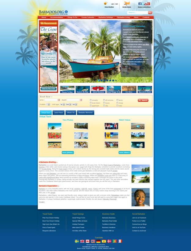
This site is a virtual encyclopedia of Barbados from the travel point of view. It has all the information a tourist needs about Barbados. The tropical colors used on the site are very Barbados, and you start getting the information you need right from the Home Page. An easy to use navigation bar, a booking module on the Home Page, and virtual tour make this the ‘go to’ site if you want information about Barbados. That’s the mark of a perfect UX.
Harrys
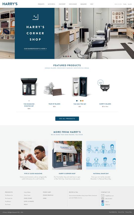
Harry’s is all about high quality razors and that’s what the company’s website is able to showcase very well. The website is clean and stays away from cluttered imagery. There are no prizes for guessing that it’s the minimalist approach adopted by the website that grabs eyeballs, whether it is the featured products page or the products pages; you actually get the sense that the company is not trying too hard to make an impression. This is what helps the website grab your attention.
Viddy
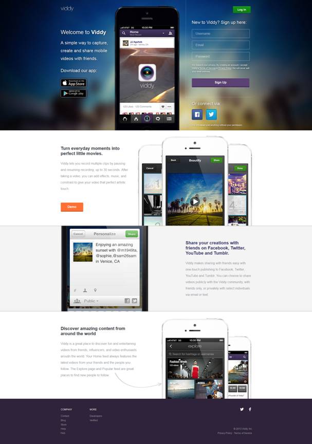
A site that allows members to use the site’s iPhone app and upload brief videos, this site needed to be really very easy-to-use and guess what, it actually is. It’s a site that has been built for short attention spans. Large imagery, limited text, means a site that focusses on making a very big impact in less. And yes, it delivers.
Served MCR
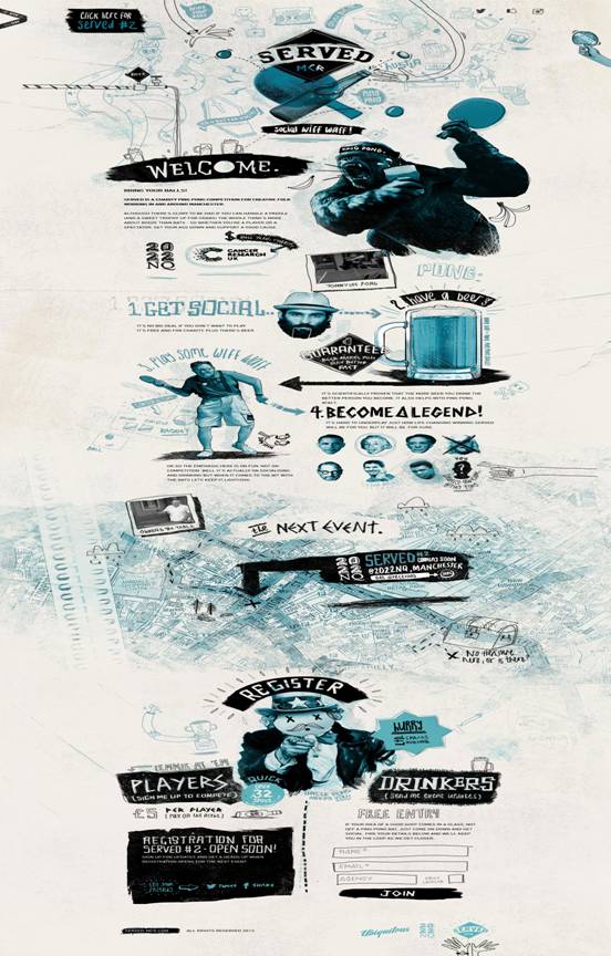
I like this site because there is a lot of movement happening, it’s innovative and offers a brilliantly crafted UX. Agreed, it might not adhere to all the tenets of user experience design, but it creates the right kind of impact. You’ll definitely want to go through this site. It uses a heady mix of illustration, retro motifs and animation to generate a visual impact. It work’s big time!
Apple
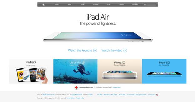
The Apple site is a rich mix of style and functionality. It’s a perfect rendering of what Apple stands for. When you land up on the Apple Home Page and go through its product pages, the one thing that you will say to yourself is, “This is Class”. Not many websites are able to deliver the classy UX that Apple does with so much ease.
So, here they are – A list of 10 websites that offer great UX. You just cannot help but get inspired from them!
Jon Reiter is the Founder and CEO at Epic Web Results – A Law Firm Website Design Company focusing on website design, search engine optimization, law firm blogging, and local geo marketing.

