Perched on the Southern edge of Washington State’s Puget Sound, Tacoma is a thriving business center for the entire South Sound region. Where once mills and factories provided the only jobs, now high-tech and service-related businesses are sprouting up to make this long-gritty town’s image sparkle. Tacoma has a thriving regional urban center and agrowing mix of international businesses. Those firms know the importance of on and off-line advertising to the success of their brand in this competitive marketplace. They realize that a modern company does not need a physical sign or flashy office as much as it needs a professional, effective website, which now serves as most firms’ electronic storefront for the majority of their customers.
The first step for a business wanting to advertise its presence to potential customers, beyond simple word-of-mouth, is to build a website. To do that, the business will need an in-house or outsourced website designer.

Tacoma web designers are a dime a dozen.Good ones, however, work through pricy marketing or design agencies. If your organization is ready to look for aTacoma website designor to hire an in-house web developer, these tips clarify communication with your designer by setting expectations that match your budget, needs and timeframe. Avoid common mistakes and ensure a job well done with this how-to guide.
1. What do you want on your website? Make a detailed list of what you want to accomplish before you start searching for a  Tacoma web designer, so that you find one who is truly capable and you can communicate your needs clearly. Do you need to optimize your site for sales conversions or search engine rankings? If you are redesigning, take note of what’s working and what’s not working. Make sure to keep all backlinks gathered over the years. Maybe you need changes with the way your site functions, a complete redo your underlying code, new content because your business has changed, or simply that you want a better-looking site.
2. Completion dates & design schedule: If you’re a planning a whole new site or drastic redesign, it’s beneficial to time site launches with the timing of a promotion. When dramatic changes are involved, make sure to create a blog post or news announcement discussing the changes. If you’re making simple improvements, slowly roll out changes unannounced and overtime.
3. Design for Call to Action: If you aren’t leading users to act (i.e. buy a product, sign up for service, contact you, or subscribe), then you’re losing them.Don’t bury links in a haystack of content; use call-to-action buttons that resemble apps to attract user attention. Also don’t clutter pages with lots of calls to action per page. Define a clear objective per page.
4. Navigation: People visit your site for specific information. Use clear & appealing icons to aid navigation. Group related links, place the most important links on the top navigation bar, but keep functional items (settings, account, dashboard, etc.) and legal information (privacy, terms, copyright) elsewhere. Provide a site map, or use tools such as Breadcrumb navigation. If you’re redesigning, try to keep important elements of your site design, such as the main navigation and header, similar.
5. Tacoma Website Design Content: Design a strong visual content hierarchy so users can quickly scan your site for relevant information. That means breaking up long paragraphs into chunks using headings, sub-headings, and bullets. Also: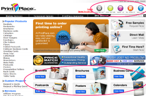
- Less is more. White space puts focus on important content within each section. Space lines, letters, and margins large enough. Marketing Puget Sound’s bloghas more information about organizing content for an optimized web interface.
- Don’t overlook the rules of writing properly. Edit and proofread to make sure spelling and grammar is accurate. Edit so that you communicate clearly and concisely. Use nouns and verbs instead of adjectives and adverbs, avoid the use of qualifiers like rather or very, and little or pretty.
6. Tacoma Website Design Graphics:
- Minimize automatic flash videos & music. It slows the site down and confuses users.
- Use the right colors for enough contrast. Check color schemes chosen by your Tacoma web designer using a free color contrast tool such as, http://snook.ca/technical/colour_contrast/colour.htm. If the text on your website does not have enough contrast from its background, it will be hard to read. Good contrast also attracts the user’s attention and defining the hierarchy of the page.
- Coordinate with branding.Keep logos updated and coordinate your website’s color scheme. Your website is usually people’s first impression of your business, so it should grow with your brand identity.
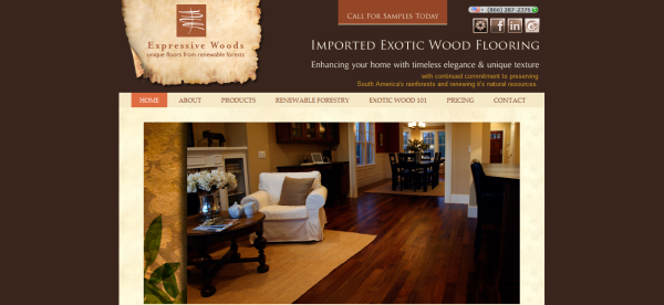
For Tacoma Website design, contact Marketing Puget Sound, has coordinated this website’s color scheme with the client logo. There is also a significant contrast between text colors and background colors.








This is really good post for web design. Only highly relevant Web Designers will have this view. I find it useful of my education in this field. If your base is good your work is good. Education build base.
Thanks for most of your articles. I admire most then to comment.