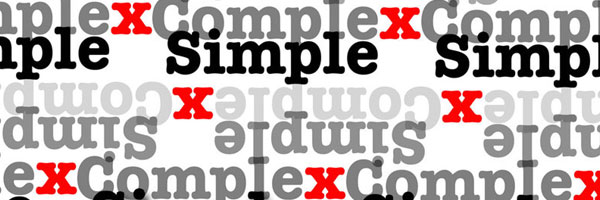
Every once in a while, designers and developers arrive at a quandary concerning which design method is more effectual…simplicity or complexity? Do minimal design concepts communicate more with fewer ingredients? Or do the illustrative and comprehensive designs more efficient in conveying the business purpose?
If you observe the renowned designs in the marketplace, you will spot both types of design concepts are in use. For instance, majority of the brands like Nike and McDonald’s have simplistic brand identities. However in contrast, some designers have also preferred complicated design patters like Wolff Ollins designed the London 2012 Olympic Games identity.

Every professional designer wants to emulate the design standards that are prevalent in the industry. The genre of design style that you make use of differs from one market to another. There is no single choice between using simple or complex designing. Both of them have possesses equal advantages and disadvantages. Therefore, let us evaluate the positive and adverse outcomes of both simplicity and complexity in designing.
Key Features of Simplicity:
- Uncomplicated designs are regarded to be easily remembered by the audience.
- There is a general proverb that ‘simple is sweet’ and that is why plain design concepts are admired.
- When you implement concepts with uncomplicated design patterns, the viewers can quickly grasp the core idea of the design.
- Simplicity allows your design efforts to steer clear of any confusion when viewed across various platforms.
- In a number of projects, a simplistic approach may not be sufficient in communicating the company message.
Key Features of Complexity:
- Complexity is required in a few projects where the message has to be explicated in detail.
- There is also a general conception that complexity through highly detailed graphics can make an impact on clients.
- On the downside, a design with excessive details is always difficult for the average customer to fathom.
- A complicated design is not easily recalled by the intended audience and takes time to memorize.
- Complexity can become harsh for the audience who may not be able to discriminate your concept.
- When you make use of complexity in your design concepts, it may lead to information overload.
In conclusion, it is not a matter of using simplicity or complexity in your designing. Rather it is how you perceive the target audience and the needs of that particular segment. If your intended client is capable of understanding complex concepts, only then make use of in-depth designing. Otherwise, you should opt for a simple and clean concept.
Henry James is a designer and blogger who runs Logo Contest Reviews. On his site, you can check out comparisons like 99designs vs CrowdSPRING and facts about 99designs scam.


