Stickers can offer a great way to get your brand out there. Not only are they cheap to produce, but people love stickers and likely always will. If you remember buying your first iPod in the early millennium, chances are that you’ll remember Apple including a number of stickers along with your product. These were the hugely popular white Apple logo stickers that would usually be found stuck to the many belongings of Apple fans.
You might also remember that these stickers were extremely minimalistic. Minimalistic designs are hugely popular right now but often, when people are designing stickers, they tend to include far too much detail and thus, their stickers become overly complicated and far from minimalistic works of art.
What’s more, due to the fact that stickers are usually pretty small, non-minimalistic sticker designs can often create quite a big problem for the sticker printing company you’re working with. If you’ve included small text or information, it might have looked great enlarged on your computer monitor but as a printed material, chances are that this small text will become unreadable and ugly.
I believe minimalism is the way forward when it comes to sticker designs so in this article, I’m going to be highlighting a few of my all-time favourite minimalistic sticker ad designs.
Droids On Roids
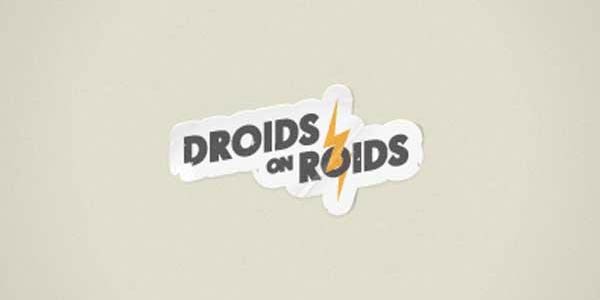
Droids on Roids is a company that specialises in creating applications for Android devices. They’re a pretty well-known and respected company but they’re also quite quirky and fun.
If you visit their website, you’ll probably see what I mean.
To market themselves in the ever competitive Android development world, Droid created these fun and minimalistic stickers of their cool logo. Simple but great.
HTML5
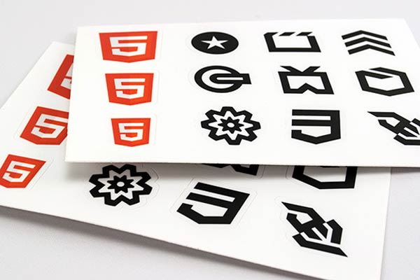
HTML5, as some of you may already know, is the standard in web development at the present time. For those nerdy coders out there, these stickers will likely make a lot of sense but to those of you without much knowledge of HTML5, they probably won’t.
Essentially, these stickers are various well known logos and symbols within the HTML5 community. They’re perfectly geared towards their target audience of coders.
Fish Bone Prints
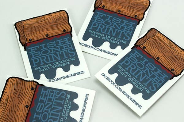
Fish Bone Prints is an amazing screen printing and design company and as you can see from these great looking stickers, they’re pretty good at what they do.
These stickers are particularly clever as they’re visually appealing and well designed, but also include useful information such as the nature of the business and Facebook page URL.
Orange Information Systems
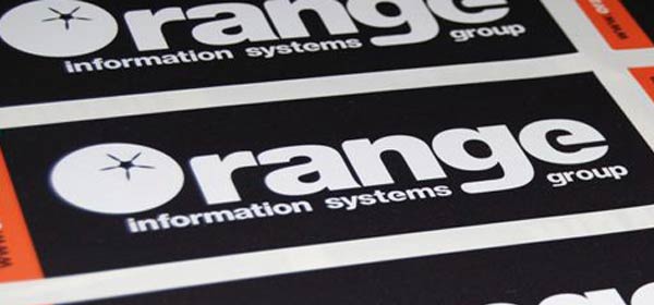
Orange Information Systems is a small business based in the UK. These stickers are particularly clever as they not only feature the logo of the company (which is a great concept too) but also are extremely minimalistic.
Not only this, but the colours used on the stickers are fantastic. They’re bold and contrasting which makes the stickers look beautiful from a distance.
Jack And Jasons
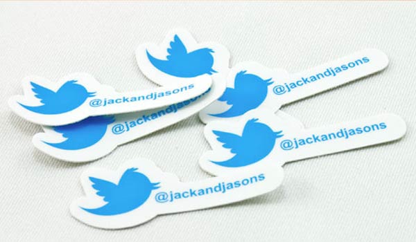
These stickers from Jack and Jasons are extremely minimalistic and also, pretty damn small. The aim of these stickers is clearly to attract followers for the Twitter account mentioned and thanks to their minimalism, they do this well.
The stickers feature the Twitter bird logo along with the Twitter handle of the account they’re promoting. No other information is needed as they do a great job as they are.
KISSmetrics
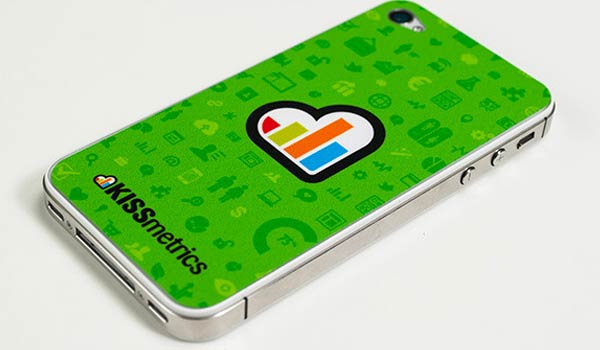
KISSmetrics is one of the many companies set up by Neil Patel; a well-known visionary within the world of SEO and internet marketing.
It seems that internet marketing may not be Neil’s only skill as these printed stickers do a great job of raising awareness for the company. The stickers themselves are pretty simple but they’re also extremely clever as they’re perfectly shaped for sticking on an iPhone case.
Kapture
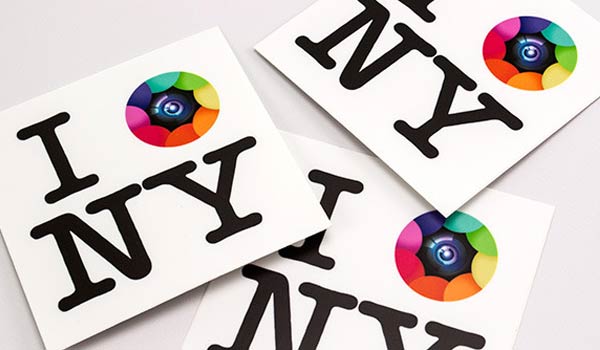
I’m sure that just about all of you are familiar with the well-known “I [heart] NY” branding and if you are, they sticker designs might look somewhat familiar.
They were created by a company named Kapture who created a photo-related app for the iPhone. As you can see, they’ve put their own unique spin on the “I [heart] NY” stickers by replacing the heart with a camera lens icon. They look great and also maintain the minimalism of the original design.
Made By Few

Made By Few is a company that arranges a yearly conference for visionaries and entrepreneurs which plays hosts to a number of talks and interviews from those within their respected communities.
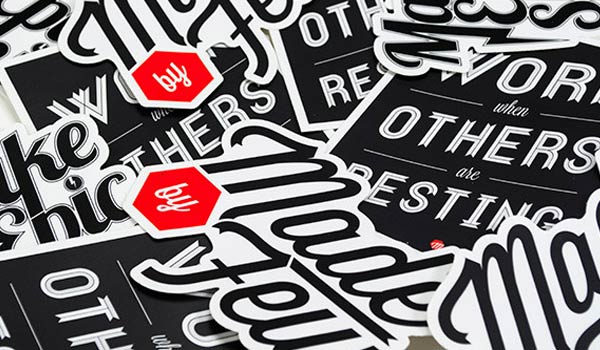
To market the company and its events, they created these beautiful stickers which as you can see, contain motivational quotes such as “Work when others are resting”.
Nyan Cat
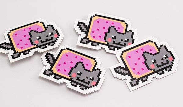
If you haven’t heard of Nyan Cat, may I suggest that you head over to YouTube right now and type it into the search bar. If you have heard of Nyan Cat however, then these stickers will likely mean quite a lot to you.
Nyan cat is an internet sensation that has racked up millions of views on YouTube. As is common in the YouTube world, the creators of Nyan Cat have now created a range of products based around the character and one of these products is the sticker you see above.
These stickers are extremely simple yet extremely clever, as they’re likely to capture the attention of the thousands of people that love Nyan Cat.
Go Media
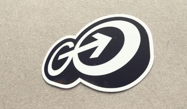
Go Media is a design company based in the United States and as you can see, they’re amazing at what they do. They created the exceptionally minimalistic stickers above to help market the company and have fun at the same time.
They have designed and branded packaging and products for some of the world’s most well-known companies and continue to be industry leaders in the field of design. These stickers have been featured on numerous design/sticker inspiration websites.
Kris is the social media manager for a printing company based in England specialising in banner, sticker and many other forms of printing.

