A brochure is a powerful tool to attract potential customers. It is equally effective to convey your product message to the wider audience. The brochures can be easily distributed to different places for quicker and effective marketing of your business. They play a major role to reach your business to a larger audience. They are functional and at the same time look trendy and stylish.
The success of your business marketing campaign depends on the design of brochure. Only a perfect brochure design and pattern can translate into an appealing and striking brochure. While you can have various layouts for a brochure design, there some common elements that inspire every brochure design.

Here are some brochure design elements that constitute a great brochure design and pattern. Applying them effectively can significantly enhance the appearance and outlook of your brochure, adding value to the brand identity of your business. With some effective brochure design tips and techniques, you can easily apply those elements into your brochure design. Here is how:
Company Name and Logo
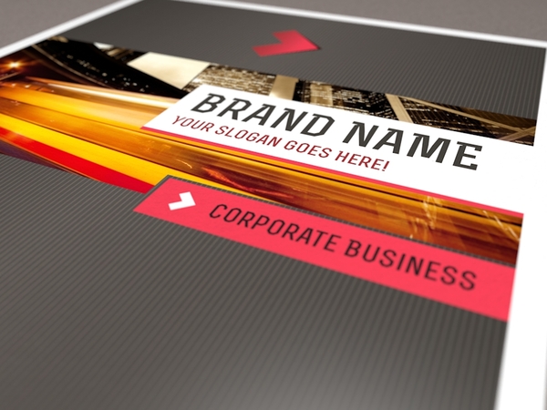
The name and logo of your company are the fundamental elements of your brochure design. The logo is perhaps the stronger elements when considered in a brochure design. It represents your company and stands for its business philosophy. This is the first thing that the customer looks on in a brochure design. The name and logo should look appealing and sophisticated in a brochure design and should complement each other. Both of these elements should stand out in a brochure design.
Brochure Cover
The brochure cover makes the first impression of your brochure design. Your brochure should stand for the product/service you are marketing for. For example, if you run a travel agency, your brochure should have pictures of exotic and breath-taking places on earth. Similarly, if you own a computer business, showing the hi-tech gadgets and gizmos will look cool and relevant to your industry. Make your pictures prominent and outstanding in the brochure.
Tagline
Regardless of the nature of your business, your tagline should clearly represent it in a few sentences. The tagline should put across the product message of your company to the readers. It can be shown in the form of a one-liner on a brochure (both at the top and bottom). The one-liner should be catchy and should translate your business philosophy. It should connote a witty or memorable element to the readers so that they can remember your product message.
Alexus Durwin is designing blogger and an official logo designer at logo pearl, a leading logo designing company and also offers their services in banner, landing page, brochure and website designing. For more info visit there official site.


Thanks for this advice. It will come in very useful.