When you think of colors, you probably first think of the colors of a rainbow. Add the in-between hues, then the different values, and finally the saturation level– the result is millions of unique colors! And you’re expected to only choose a few swatches for your design from this vast expanse of color? Fortunately, this task isn’t as difficult as finding a needle in a haystack. With some fundamental knowledge, guidelines, and tools, you’ll be able to compose an effective color palette with confidence.
Some prepwork
There isn’t a “best” color palette out there. Every design calls for its own set of colors depending on what the purpose and message of the business or website are. Clearly, a childcare business is going to demand a different color scheme than a rock band. Decide who your target audience is, what personality you want to broadcast, and what message you want to communicate. Play around with several words and concepts. Once you’ve determined your concept, internalize it and make it concrete. Try writing it down so you can return to it as a reference point later.
Some jargon
There are some technical terms that you should familiarize yourself with so you’ll know what to look out for.
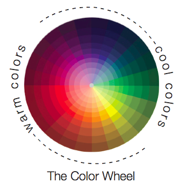
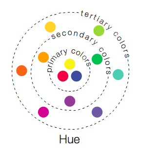
Hues are what you think of as different colors. You can organize hues into subcategories of primary colors, secondary colors, and tertiary colors. There are also warm colors and cool colors.
Saturation describes how bright or intense a hue is. Highly saturated colors haven’t been mixed with any white or black yet.
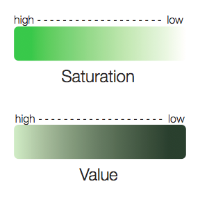
Value is how dark or light the color is. High value is called tint, whereas low value is referred to as shading.
This color wheel pretty much captures the spectrum of colors – each hue, saturation, and value.
Some rules
Stick to it
When you land on a color palette, stick to it. In doing so, you can potentially incorporate it as part of your branding. Companies such as Target, FedEx, and Coca-Cola effectively demonstrate this. However, if you get sick of your color scheme and want to move on to a new one, transition from one to the other in such a way that you’re unveiling a new version of your product. You’ll then need to adhere to this new color scheme and avoid reverting to the old one (otherwise you’ll confuse people).
Less is more
If you’re designing a logo, start by trying out two colors. A logo is used as a form of quick communication so it needs to be sharp and concise. If you use too many colors, you’ll be giving people too much information to digest. If you’re designing a website, stay in the ballpark of three colors. If you use six or more, you’re essentially displaying a rainbow and you’ve lost focus.
Don’t ignore white, black, and gray
They are colors too and each hue interacts with them differently. You need to be mindful of what your neutral color is going to be because that will affect how the rest of your color palette looks.
Make it accessible
Everyone’s eyes are different so make your color palette as accessible as possible. Provide enough contrast so people don’t have to strain their eyes. Many people are blue/violet and red/green colorblind, so just stay away from those color combinations.
Colors connote
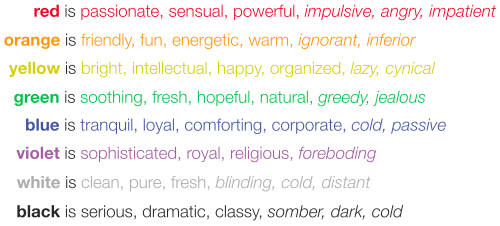
As a society, we’ve developed some connotations for each color. Of course these colors signify something different culture to culture, so don’t read this as a list of hard facts, but rather as a suggestion of popular notions. You don’t necessarily need to pick out colors directly by their “meanings” but you should at least be mindful and aware of what others may subconsciously think when they see certain colors.
Some tips
Now that you’ve done the prepwork and learned some basics, you can now go on choosing your colors. Here are a few strategies you can use to get you started. You can start with one of the strategies and then incorporate another – mix and match them. Use these strategies as a starting point and see where they take you.
Refer often to the concept that you developed earlier and see if the colors you’re putting together resonate with this. Also try to put yourself in the viewer’s shoes so you’re looking at the colors with a refreshed eye. Your eyes know best, so trust them! You’re a consumer too, after all. Go with what feels and looks good.
![]()
One strategy you could use is to pick one color and match it with a couple variants of the same color (such as different values of this one color) to add depth. By using one color, you increase the efficacy of your brand because your identity is devoted to this one color, rather than split amongst more. However, by using just one color, it can be difficult to draw attention to something that you want to highlight. Done right, a monochromatic scheme can look handsome and clean.
![]()
Complimentary colors are located across from each other on the color wheel. You know when a glass of plain old ice water tastes extra delicious after some yard work on a hot day? Or how that pinch of salt just makes caramel taste so much sweeter? Opposites often have a tendency to enhance, or compliment, one another. Colors do this same thing. The next time you see a red cardinal or pink rosebush, notice how they just seem to pop against a backdrop of green. Pick a color, draw a diameter straight across, and move around the circle. Take a look at all the complimentary color combinations there are. Most of them are visually appealing. If you feel comfortable, keep one color stationary and move its compliment a notch or two in any direction. You’ll find some interesting color combinations this way.
![]()
Try using colors in the same value ring. Because value is the amount of lightness or darkness of a color, each value will connote something different. It would make little sense to have an airy pastel pink with a rich velvety navy. (That color combination looks bad anyway.) Similar values will visually tie the colors together and subconsciously communicate a unified message.
![]()
Using colors adjacent on the color wheel can look nice, but it’s a bit trickier to pull this one off. This is most effective if you add a third color in to provide some sort of contrast. Analogous colors inform one another (i.e. you get green from yellow, blue-green from green, etc.), so naturally, they feel right together and create a sense of harmony. But don’t forget your audience’s eyes – we need enough contrast to derive information. So if you decide to use two adjacent colors, choose a third neutral color or a contrasting color so people have an easier viewing experience.
Some tools
There is an entire color community out there and they’ve created some useful tools to help you develop your color palette. If you still don’t feel confident in your skills, you could even use a color scheme someone else created.
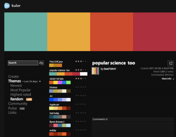
Adobe Kuler makes it really easy for you to create a color palette. With presets such as “monochromatic,” “complementary,” and “analogous,” all you have to do is click around and see which palette is your favorite. If you use this tool, I recommend deleting some boxes because choosing five colors at a time can be rather overwhelming. They provide you with the RGB, CMYK, and Hex codes so you can keep your colors. You can also browse all the palettes that other users have made.
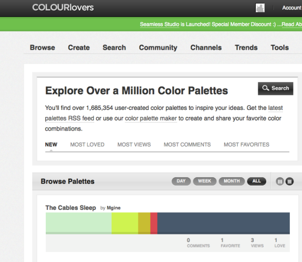
COLOURlovers is similar to Kuler, but includes an additional dimension that allows you alter how much of each color swatch to reveal. You’ll see that this really changes the look of the palette. You can use small swatches as an accent and large swatches as a base. COLOURlovers is also a useful tool to find and make patterns. This community is rich and artistic – truly inspirational.
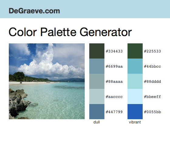
Color Explorer, Color Hunter and DeGraeve allow you to generate color palettes based off of images. This could be an easy starting point if you have a particularly favorite image. However, both tools generate a five-color palette, so you’re going to need a discerning eye to determine if it’s too many colors or not.
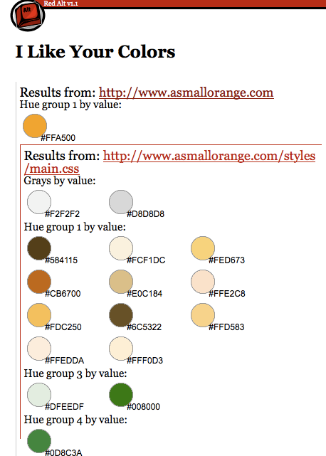
I Like Your Colors by RedAlt will provide you the color palette used by any website. So if you come across a website that has a particularly inspirational color scheme, just type in the URL and you can see exactly what colors they’ve used and you can build from there.
Now that you have a general lay of the land, you are now better equipped to tactfully compose the color palette for your business or website. Determine what message you want to convey to the public and refer to this concept often when putting colors together. Start with some basic color composing strategies and then throw in your own flare. Play and have fun! There are several useful tools and communities available to help make what could be a confusing task, much more palatable.
Nina Wu writes for A Small Orange.






This is all foundation to color theory stuff. Seriously. Now why wasn’t it explained to me in terms as simple/truthful as these?! This is so much easier to understand. Thanks
Very useful post. Thanks
Thats a wonderful article Nina Wu 🙂
Indeed helps designers.
You could add up little more
http://uicart.com is one website recently introduced which helps searching existing UserInterfaces with color patterns.
and also colorcombos.com which lists new patterns
Depending on the type of business that you have, one practical aspect to consider when choosing your colors: will the items I need to run my business be available in my colors?
If you pick unique colors, you may not be able to get things like tissue paper, ribbon, stock packaging, customized business items like pens, stock packaging, etc. to match.
When you are first starting out, the last thing you want to do is spend a bunch of extra money for custom colors. I have actually had to make some adjustments to my company colors given the availability of certain supplies in a limited color pallet.
Great stuff. I was looking for meaning of color, what color represents. Since this article now i would go for Green or Blue both looks perfect for my new business.
Thanks dude.