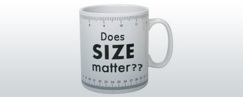
Every now and then, you will get a client who will demand a logo that is bigger in size and proportion. Without giving priority to the quality and meaning of the design, they would insist on getting an identity that is larger in dimensions. Their justification for this argument is that since they are paying for the work, they should get maximum benefit out of it. But a bigger logo isn’t the right way of acquiring utmost benefit from your corporate identity.
The concept of getting a logo design is often misinterpreted by some clients with buying a meal from a fast-food outlet. A logo isn’t a touchable object that can be quantified. Rather, it is an intangible service that has intrinsic features that define its quality and effectiveness. A common client argument is that a bigger logo will make more impact on their intended customers. But they overlook the fact that bigger isn’t necessarily better. Size of the logo design has an imperative role in brand identity design. Following are a few pointers for determining the correct size of your logo:

Avoid a Busy Design:
If you create a logo that is bigger is size and devoid of any meaning, it will create more distraction to the target customers when they are broadcasted on various mediums. You wouldn’t want your customers to remember your corporate identity as the brand that was irritating, unsettling and horrific to watch.
Accommodate the Message:
As opposed to demanding a jumbo-sized logo, clients ought to concentrate on getting their core business message transmitted. The real purpose of a logo isn’t to be mightier in size, but to be effective and meaningful in design. Even a small sized logo can do wonders if it accurately depicts the company message to the target audience.
Use of Negative Space:
Many designers try to keep the design layout simple and minimal. But some clients perceive this as incomplete design. They would go ahead and insist that empty space be filled with something useful. But they don’t really understand that it is not just empty space…it is negative space. Less designing elements gives you the chance of employing creativity of negative space. Much like the FedEx logo which incorporates an ‘arrow’ between the ‘e’ and ‘X’, you can utilize the unfilled space to add a meaningful message.


