We keep talking about how your website’s design must be unique, the importance of audience engagement through its design elements, the ability to tell a story through the design etc. What nobody discusses extensively and which lies at the very root of all successful websites is ‘personality’. Yes, every successful website has a personality of its own; some are humorous, others are passionate, there are still others that are elegant, while there are many others that exude professionalism of the corporate kind.
Personality in website design is like an umbrella term that encompasses a lot of elements. It’s about how you keep the browsing experience interesting, it’s about the message that you want to deliver, it’s about the features that you offer your users, and the kind of takeaway that you want your website to project. But when you get right down to it, when you talk about the ‘personality’ of your website, there must be a bit of the designer in it and also a bit of the client as well.

The whole idea behind creating a website that has personality is to make sure that it can connect with its users on a personal level. It must speak to them in their language, and must appeal to them in manner that they can understand best.
Let’s take a look at how you can go about adding some personality to your website:
Create a Distinct Emotion
Can you create an emotion? Why not? Before you begin designing your website identify that one emotion that you want your website to carry. This emotion can then be conveyed to the users who in turn might imbibe this emotion.
Why are we talking about emotions? That’s because your website is going to sell something and buyers only make emotional decisions. For more on this topic please see the article Buyers Make Emotional Decisions and Justify Them Later, it will give you a better idea about the whole concept of making emotional decisions. But what emotions also do is that they help a website, which is an essentially a technical creation, get some human characteristics. The fact that it has a specific emotion attached to it makes it more human, which in turn allows users to connect with it.
To illustrate this point, let’s talk of humor in website design. The emotion associated with humor is ‘mirth’; this could range from mild amusement to all-out laughter. You must have come across plenty of websites that have made you smile with their clever use of funny images, hilarious catch phrases and the design elements that enhance the humor. The idea is to persuade the user to take a call to action through humor, by making them laugh, by nurturing ‘mirth’. Their takeaway from the site is “that website is funny”, a statement that is usually made with a person in mind.
Here’s an example of a site that adds a dash of humor and immense usability in equal measure.
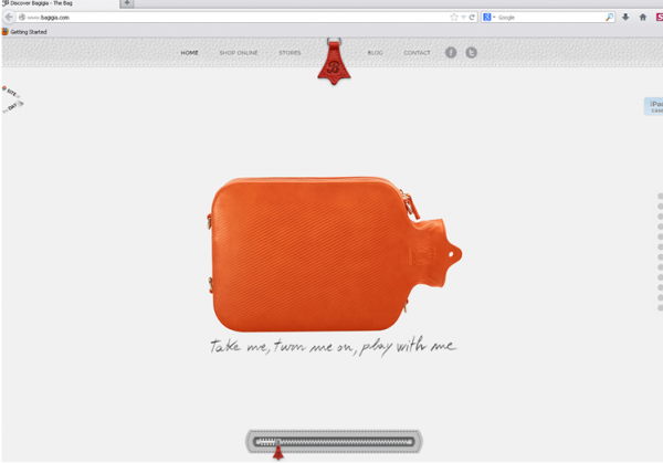
The Bagigia website is intuitively designed and there is some intelligent humor in it. That bag and the words written below it make for some subtle humor. What’s more this humor doesn’t interfere with the ability to showcase its product in the best possible manner. The website allows us to discover the bag, the way it’s supposed to.
Creating an Identity
Personality can be projected through a character that your users can easily identify with. This, as can be imagined, is not easy. This is where your skills as a designer, your own personality and that of the client come into the picture. Say you are designing a website that is an online presence of pizzeria. How would you go about creating a character or a mascot for the site?
Here are a few things to keep in mind:
- Fix on the persona for the character/mascot?
- How do you want it to look?
- Do you want it to be human or an animal?
- Do you want it to appear on all web pages?
- Do you want this appear in all brand promotion material of the pizzeria?
These and many other questions needs to be answered before you design your character or mascot. This article on How to Create a Website Mascot, explains the technicalities of creating a mascot. If it’s a pizzeria, the character of a Pizza Delivery Guy will be a good character; for my money, he/she must have a disarming smile, a mischievous glint in the eye; one look at the character and users must feel that the person loves delivering pizzas.
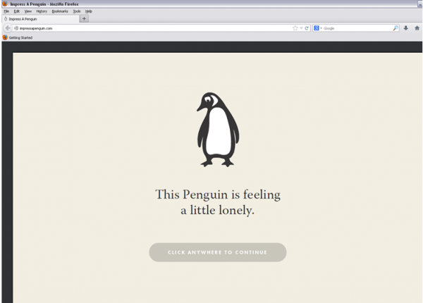
The Impress a Penguin website is an advertisement for a job; that of a Community Manager at Penguin press. It intelligently uses the Penguin character, which is the mascot of the Penguin press and makes good use of it in the website’s design.
Freehand Drawings
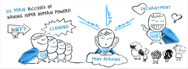
If you want to show personality, then there is nothing better than freehand drawings and sketches to project a personality that users can relate to. Think about it for a second, do you like going through a handwritten letter or something that is typewritten? The former is a more personal way of communication and thelatter is devoid of any human touch whatsoever. When a user accesses your site, he wants to believe that the website is a more of a human creation rather than something that has been built using technology (although this is actually the case).
This is why the use of freehand drawings helps create a unique identity for your brand, as it’s something that is unique to your own personality as a designer. With it you are differentiating your website from that of others. What you are also doing is making your website more recognizable by giving it a lot of character. Users are more apt to be taken in with hand drawn sketches rather than something that looks like a technical creation.
Such drawings also foment trust between the users and the people behind the website. This is crucial for website success.
Get the Users Involved with the Content

Personality is not projected by the use of images alone. The usability of your site and the user flow that your site subscribes to, also determines the way a user looks at it. You need to use the right mix of words and pictures to draw in the visitors; your visitors must not just like the content on your site, they must believe that it’s helpful to them in some form or other.
The content that you write must be engaging. You must offer information in a manner that a reader will immediately relate to. Remember, your readers are your friends, they are also your equals, and some might even have more experience in your domain then you do (I am talking about the client’s domain here). It’s not enough that your audience likes what you have written; they must also trust what you have written, because it’s only if they trust you, that they will want to know you. So, make your content work for you, this is what creates the right kind of personality. This article on building trust with your audience is a very good read. It will help you write better content.
End Words
Personality hunting for your website isn’t an easy sport. You need to adopt a personality focused approach right from the time you are conceptualizing your site to make sure that you can add a dash of personality to it. It won’t happen in a hurry and at times, you will find that an element or a write up that you felt added more character to your website fell flat. So, you will need to keep tweaking the website design to ensure that you infuse it with that much needed personality.
Pete Juratovic is the Strategic Director and founder of Clikzy Creative, a website design company in Washington, DC. Clikzy Creative also offers fashion website design, search engine optimization, and many other services.



Personality is important to build readership. Nice tips. Thanks for sharing.