There are people who are already calling flat web design a new era in website designing. There is no doubt that its seeing growing adoption amongst designers, who believe removing textures, shadows, gradients and other complex design elements serves to improve the usability of a website. A trend or a revolution is only the sign of the times, and it’s our continuing obsession with usability that has seen the world of web design become enamored of flat web design.
Whether you believe flat web design is the next big thing or not is immaterial. It’s there, it’s being used, and it’s also very popular. So, you must make sure that you are able to optimize and use it. Take a look at some of the best practices of this designing technique that will help you leverage its potential:
Don’t Think Of It As A Hot New Trend
If you plant to take the flat web design approach to design a website, make sure your decision is backed by solid purpose. Don’t use it just because it’s the in thing. Use it if you think a flatter visual aesthetic will help your website create a better impression on its visitor. Also, don’t compromise your creative and designing decisions just because you want to use flat web design. For example, if you think a skeuomorphic design is better suited for your concept, don’t choose flat web design. Make an informed decision while choosing flat web design.
Work Around The White Space
The absence of drop shadows, gradients and complex textures is the defining characteristic of flat web design. This means you are left with a lot of white space to play around with and you need to use it effectively to create the necessary impact. Position your design elements in a way such that the white space becomes an important design element in your layout. Treat it with the respect it deserves.
Inspiration
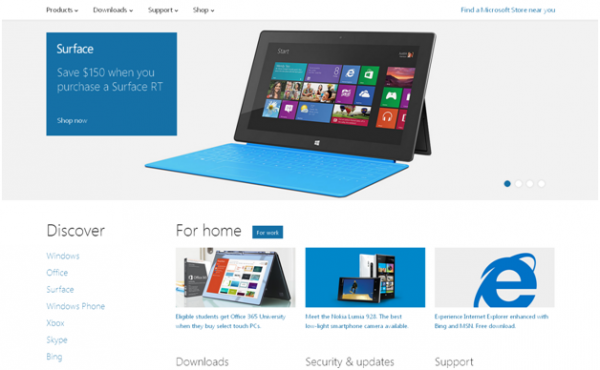
Microsoft.com is a text book example of how white space can be used to showcase professionalism, usability and impressive visual aesthetics all at the same time.
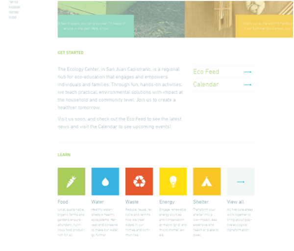
You also see a whole lot of white space on The Ecology Center, but the use of flat UI colors for its icons and the right typography means that the white space serves to accentuate the visual aesthetic.
Respect Typography
If you don’t choose the right typography, your flat design is done for. The purpose of flat web design is to convey the website’s message with simplicity but at the same time create the right impression. You are limited by your choice of visuals and therefore must depend on strong and impressive typography to make the necessary impact. You will see many websites using typography and not an image as their design centerpiece.
Inspiration:

The guys at Etch have made typography the centerpiece of their website and it looks great.
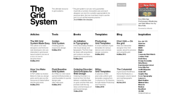
The home page of The Grid System is text heavy, but the design makes an excellent typographic choice and uses it brilliantly with white space to create an amazing visual impression.
The Use Of Buttons
One of the ways designers make sure that end users know the buttons on the website are clickable is by using a gradient and drop-shadow so that the button seems to rise up from the surrounding layout. But, flat web design requires you to use flat buttons and you still need to ensure that users know that they are a clickable element. This is possible if your focus is on using contrasting colors as compared to the background and content or you could even use a bevel and shadow, but make sure that their use doesn’t compromise the flat look of your button.
Inspiration:
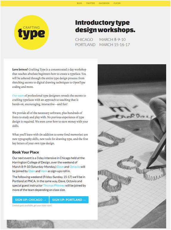
See those two blue buttons on The Crafting Type home page? They stand out from the surrounding content and there is no doubt they are clickable.
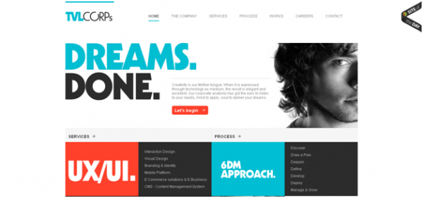
The Let’s Begin button on TVLcorps Technologies can be clearly identified as clickable.
The Right Choice Of Colors
Flat designs don’t reduce the importance of colors. The focus in such designs must be on the use of colors that are bold and bright. Colors must be used as actionable design elements and should also promote consistency. For example, all your call-to-action buttons must have the same bright color and so on and so on.
To further improve upon the color scheme of your web design, you can even think about combining multiple colors and background panels, provided they are able to make the kind of impression you are looking for.
Inspiration:

One look at the site and you know the guys at Fitbit have got their color combo right. Also the use of color gels perfectly with the flat web design of the page, highlighting its most important parts perfectly.
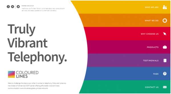
Colored Lines is a shining example of using colors as the showcase design element. There are no images on the home page (apart from the logo). It’s just an interplay of colors.
Use The Minimalist Approach
Use only those design elements that are absolutely necessary for creating the necessary impact. Don’t crowd the layout with elements that jostle for attention. Make sure that your website is able to do more with less. With flat design your creativity and web designing proficiency will be tested to the hilt, because you need to limit your designing choices to only those that are absolutely necessary to make an impression on its visitors.
Inspiration:
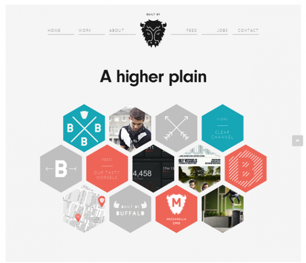
The Built by Buffalo website is flat web design with focus on minimalism. It showcases the website’s purpose amazingly well, with limited use of design elements.
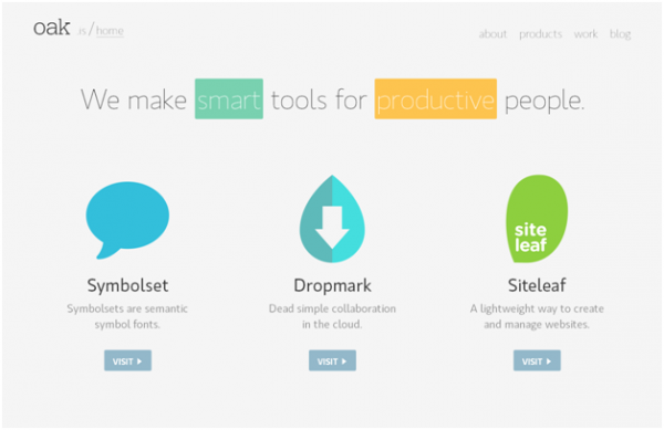
Oak.is is a prime example of a website blending a minimalist approach with flat web design techniques, and to say that the result is impressive is an understatement.
If you want to nail Flat Web Design, you must think simple, but remember there is huge difference between simplistic design and design whose visual and functional appeal lies in its simplicity. If you have got the differences sorted out in your head, you will definitely be able to come up with some great Flat websites.
Abhishek Agarwal is Director, Business Development at Rightway Solution, a prominent firm involved in developing mobile apps. Abhishek is also an ecommerce site design expert. Feel free to have a chat with him on Google+.


