If you’re a blogger and you interact with people offline then you need a business card.
Darren Rowse from Problogger has included business cards as one of his 5 ways of promoting your blog at a conference and business cards are widely considered to be one of the most effective offline ways of gaining blog traffic.
So great, all you need to do is head off and get some business cards printed, anything will do, or perhaps you can just ask your mate, he’s a designer.
STOP!
When you designed your blog, you thought about your audience.You had to overcome technical challenges select hosting and deciding which blog platform and plugins to use.You also had to overcome challenges of a more creative nature, how will your blog look, what tagline should be used, what’s your elevator pitch etc. Creative and technical challenges also exist if you want to design a business card that works for you.
Here are my top 15 tips to help Bloggers like you get the most out of your business cards:

1. Know Your Audience
Your card needs to communicate the value that you offer to each of your cards recipients, what problems you can help them solve, who benefits from your service?
Just because you know what you do, don’t expect others to take the time, spell it out for them with a catchy slogan or short USP.
2. Prioritise Information
Your card is a reminder of an event, the place in time that they met you, so your name should be the main focus of any card.
You then need to prioritise your preferred method of contact, for many bloggers this would be your e-mail address, just remember the client is king so it’s their needs not yours that need to be considered, for instance if your typical prospect operates on the phone you simply cannot leave of your number.
TIP:List everything you could add to your card and start to prioritise each point, remember to let people focus on the most important points; you shouldn’t be including all of your contact details.
3. Include Your Social Media Profiles
Bloggers mostly operate online, so it’s important to include your Social Media Profiles. But don’t include profiles that you don’t make use of; poorly maintained profiles will simply make you look unprofessional.
4. Make it Memorable
Your card is the last thing you leave when you meet someone, and the first thing that people throw away.
If you’re standing among a group of people at a conference you want people to notice you and your card, so make sure that the design is effective and leaves a lasting impression.
5. BloggersUse Both Sides
Cards have 2 sides so make sure that you use them, the reverse of your card can be used to present less crucial info.
If you own or write for several blogs this is a great place to list them, or to place a QR code (more on this below).
6. Consider Your Picture
Blogging is a highly personal activity so adding your picture to your card is something you could consider.
Your image will help match your card to you after the event, if you (like me) don’t take a great photo then consider hiring an illustrator to create a more flattering likeness.
7. Avoid Odd Sizes
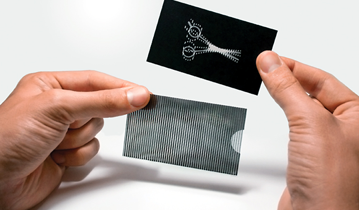
Odd sized cards can seem like a great idea, a way to attract attention and set you aside from the competition, but be careful. Unusual sizes are sometimes less easy to carry and don’t fit into wallets or rolodexes,they are therefore prone to being discarded after the event.
8. Make it Accessible
If you plan on dealing with people who use different languages consider different language versions.
TIP:In different parts of the world there are established customs to consider, ensure that you research and follow these customs as appropriate.
9. Different Cards for Different Folks
One conference maybe quite different to another, in which case consider different card designs for each event or conference, use this method to maximise design impact and focus directly on your target market.
10. Personalised Landing Pages
Help the card recipient find out more about you by linkingto the about me or personal page on your blog.
If you run or write on several blogs you may consider providing a link to a page which lists these to cut down on card clutter.
11. Add an Offer
An offer focused on your target market is a fantastic talking point and a great way to make you and your card memorable.
To ensure maximum effect make sure you mention the offer to everyone you hand your card too.
TIP:Try to make the offer relevant to the recipient.
TIP:Make the offer exclusive by limiting it toonly the people you give your card too.
TIP: Track how effective your cards are by making the offer event or conference specific.
TIP: Make use of Bitly links or QR codes to help your recipients take advantage of the offer (more on QR codes below).
12. Make it Scanable
Many people use OCR software to scan in the cards they receive, find out how to create OCR scannablebusiness cardsat Gigaom.
If you want to scan the cards that you receive check out the following resources:
- http://www.scanbizcards.com/
- http://www.cardmunch.com/
13. Make itHigh Tech
QR codes are being used all over the place; they are a great way to convert offline info and links into online action.
Your QR code could be used to link to a page on your blog, your favourite social media profile or it could contain all of your contact details.
TIP:Check out: http://www.qrstuff.com/
14. Hire a Pro
Don’t leave design to chance, once you’ve worked through the above points and ironed out what you need,talk to a professional graphic designer.
Don’t be afraid to be prescriptive and tell them what you want, the fact is most designers want as much guidance as possible.
TIP:Make sure you select and talk to a great printer or better still get your designer to do this for you.
TIP: The way that your card is printed and the material and finishes applied can make all the difference. Before your card is printed insist on seeing samples of the suggested materials and finishes.
15. Make Sure Your Card Stacks Up
Before you send the card to print ensure that it compares favourably to others.
TIP: Ask a few strangers to glance at your card and ask them to tell you what you do.
TIP: Mix your card design up with others in your collection, accesshow your card compares.
BONUS TIP: Free Plastic Business Cards
That’s right for Free…
Currently Harry BuggLtd is helping bloggers like you by offering 200Free Plastic Business Cards; the offer is open to only the very best bloggers and terms and conditions apply, to see if you’re eligible contact Justin [@] harrybugg.co.uk.
Justin March is a blogger working for Harry Bugg Ltd a marvellous company who print credit card style plastic cards for all types of applications. The company provides plastic card printing to companies in all sorts of industries from Membership Cardsat yourlocal Gym, to Discount Cards for Shoppers,to Loyalty Cards in your favourite Hotel.


