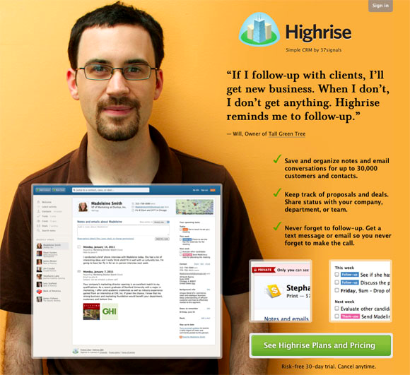
It is interesting to observe how each new online venture, at the beginning, think first in a professional and stylish web site and forgets something more important like customers and their context.
Designing an efficient Web Site that can attract new customers and also increase sales is a different world that as entrepreneurs we must understand and master. This type of web site that specializes in selling is commonly called “leading page” and this is how we will from now on call it.
In order to share what we learned in the last 5 years while developing the start up elMejorTrato.com below we will develop the most important aspects to take into account:
1) Simplicity requires more work
At the start we thought that “the more we offer the better”; however, being guided by that thought led us to our first lesson.
Both, in the online and in the offline world the simpler, the better. Just look at McDonalds, where there are only some combos to choose from and that’s it. What demands hard work is to understand what the customer wants, and more importantly, what they DO NOT want.
A historical example to deepen this key point: as Blase Pascal said on his legacy: “I have written this letter more extensive than usual because I lack the time to write it shorter.”
Consequently, “more” is not a synonym for “best”. And what connection does that have with developing a Landing Page that specializes in selling for our enterprise?
Almost everything. It is the foundation from which we must begin. Let’s now see examples:
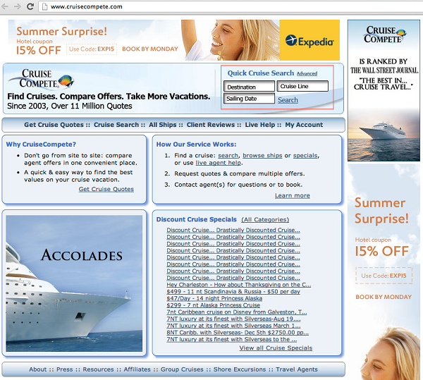
First there are two examples of what shouldn’t be done; please look at the red boxes that are the “Call to Action” / call for sale:
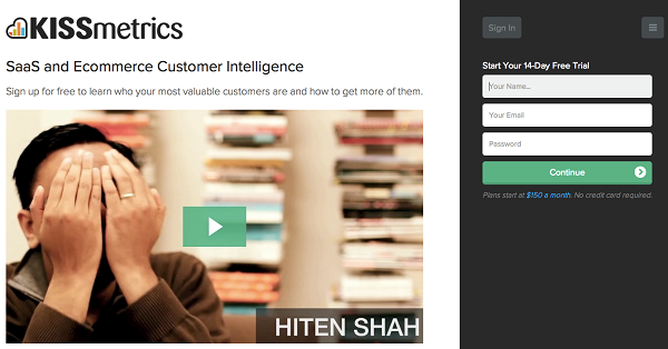
Now, going straight to what must to be done, focusing only and exclusively on the message that has to be transmitted through a title sending a differential message in our benefit, followed by a sub-title where it is stated how we will do this and finally the “Call to Action”:

2) About design: we should not save on
As entrepreneurs, we should save on almost everything that we can; however, saving on the design is definitely not the smartest choice. It is unfortunately what the vast majority chooses; like us, we made that mistake at the beginning and then it double the cost (time, effort and money) as we had to re-design everything from scratch.
The design of our website is pretty much what the customer observes, analyzes and takes into account when the time to make a decision comes: using our services or not. So the design can lead us to success or failure.
A good design conveys several things that could be crucial, such as:
Security: This feature has to be well expressed as we need the user to feel the confidence to enter their credit card, in our system in order to make a purchase.
Labour: the client must perceive that behind that page there are people working and making an effort to make they feel comfortable.
Quality: Finally, as entrepreneurs we must charge for our services; and, if we would like to be paid, the quality of the service is essential.
Consider a simple example below. As we have done, let us first see what must NOT be done:
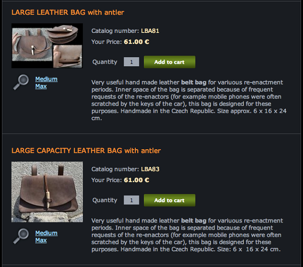
Now let’s focus on what has to be done to achieve the maximum efficiency in our online sales:
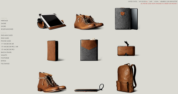
As you can see, the design is not a minor external aspect. It is a fundamental one that if it has the correct implementation based on a coherent work; it can lead to excellent results.
3) Small details make the difference
Finally, let’s look at some little details that I would like to share; we learn them when trying to improve our sales conversion through Internet.
First, a way to transmit the security through the Internet is by having our clients to express positive comments of what they have learned. Example:
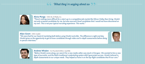
For this to succeed, we must minimally write the full name of the person (not as “anonymous”) and even better if we acknowledge their position and company that they work for; to give greater transparency to the process.
Another interesting point is to think through the customer’s eyes who are unconsciously seeking safety signs. This is clear for large sites like Ebay, BestBuy, among others; and to our enterprise the option of using them is extremely important (e.g. VeriSign):

As you can see, these are classic signs. It is important to remember that common visual signs transmit security in our favor.
Another factor is to use brands of associated, suppliers, customers, among others, to convey security. Especially when you’re starting out as a start up and no one knows you, using known and emblematic brands is fundamental.
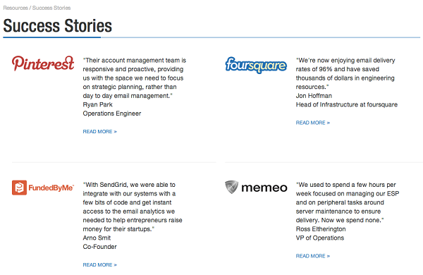
Moreover, a more interesting factor is to understand that putting public repositories images of people working in our website will convey insecurity. Consider first an example of what not to do:

On the other hand, an example of what we have to do: put an image of a real person, who conveys assurance that is talking about something real and serious:

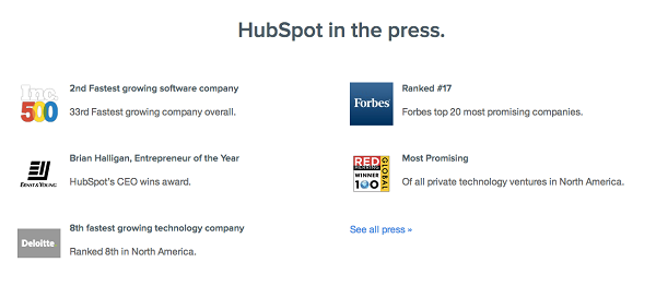
Finally, whenever we have a press release on a magazine, newspaper or online news, it is good to refer to it to convey relevance of our work to those early adopters that have got to know about us, example:
Guest Writer: Engineer Cristian Angel Rennella, Co-Founder of oMelhorTrato.com in Brazil. Translated by Virginia González.

